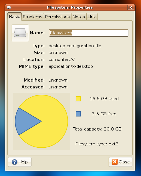
75% of my Filesystem represents… PACMAN!

And that reminds me… some people requested that I upload the slides of the GNOME CLUG talk I presented a few weeks ago. Get them here.

And that reminds me… some people requested that I upload the slides of the GNOME CLUG talk I presented a few weeks ago. Get them here.
You must be logged in to post a comment.
Am I the only one who thinks that this chart is way too big?
I think the dark gray box surrounding the chart looks ugly. The size looks fine to me though.
I agree that the chart is a bit big. The dark gray box in the background *might* be due to a GTK bug, I haven’t tested yet.
The pie chart for your disks is a new feature in Gnome 2.20 (pity it only has it now, since Windows had it since Windows 95). Help make it better in future (post-gutsy) versions of Ubuntu- file bugs at http://bugs.launchpad.net
http://igordevlog.blogspot.com/2007/09/my-filesystem-type-is-packman.html
@jonathan: You are not the only one that gets pacman :)
@All: I think that the gray box is a theme issue of Jonathan theme, because as you see in my screenshot I get no grey box, and the chart size looks very good to me.