New Edubuntu Wallpaper(s)
Some people seem to just love talking about history. I prefer making it! Here’s something a bit more light to distract you from all the history lessons currently on Planet Ubuntu…
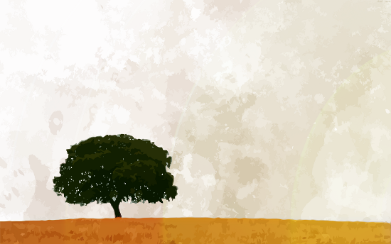
Current Edubuntu Wallpaper
The current Edubuntu wallpaper has served us well now for a few releases. It’s simple and powerful and works across a wide age group.
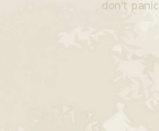
In Edubuntu 10.10, we had a bunch of Hitchhiker Guide to the Galaxy easter eggs to coincide with the 10.10.10 release, which I partially blogged about before. A small change was introduced to the wallpaper in this release; if you look really closely in the top right hand corner on the Edubuntu login screen, you’ll notice that it has the words “don’t panic” written on it. This was my favourite easter egg in the maverick release.
New Default Edubuntu Wallpaper
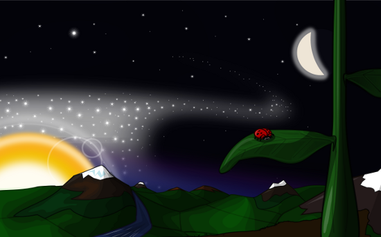
Martin Owens has done a great job of putting together a new wallpaper for us. When I first uploaded it to the Natty archives I thought that we’ll probably get some people who say that it’s too “cartoonish” (which we did in the meantime), but if Debian can get away with having the Space Fun theme for a universal operating system then the ‘cartoon’ critics can at least give a bit of leeway for Edubuntu here.
It was originally called “Perspective” when the first concept was put together. It’s a little bug on a little leaf with a view of a valley and a whole galaxy behind it. Even though it is somewhat cartoonish, the perspective theme is probably something that the older crowd will understand a bit better. I’ve tried it on Edubuntu for the last week and it works really well. It might still go through some tweaking so the final version may be a bit different than the picture above. Thanks to Martin for all his efforts so far!
What happened to the artwork competition?
Most of the submissions we received didn’t quite align with the specification we set out (some of them included text (hard to translate, doesn’t like scaling), some pictures of books or world maps (clichés)- things that we specifically wanted to avoid) and we were approached by Martin who said that he’d be willing to do a wallpaper and work it through various iterations. We notified the artwork team about this, there were some mixed feelings on both sides, especially considering that the submissions were still really quite good despite not being quite suitable as defaults. So what we’ll be doing instead is include the wallpapers that have been submitted to the competition as alternative wallpapers in the system. There aren’t many of them so at least they won’t take up too much space. I’ll do another blog entry especially for them when they hit the archives.




Oo. Quite good, actually.
If you made the river wend off to the right at the bottom, you’d have a very clear path of focus: from the ladybird, dripping off the leaf, along the river, behind the mountain to the Sun, along the starstream and away!
I like how the lines on the hills imply contours, and the Moon is near enough astronomically correct (a bit too full, but I’ll let you off).